
Kisumo
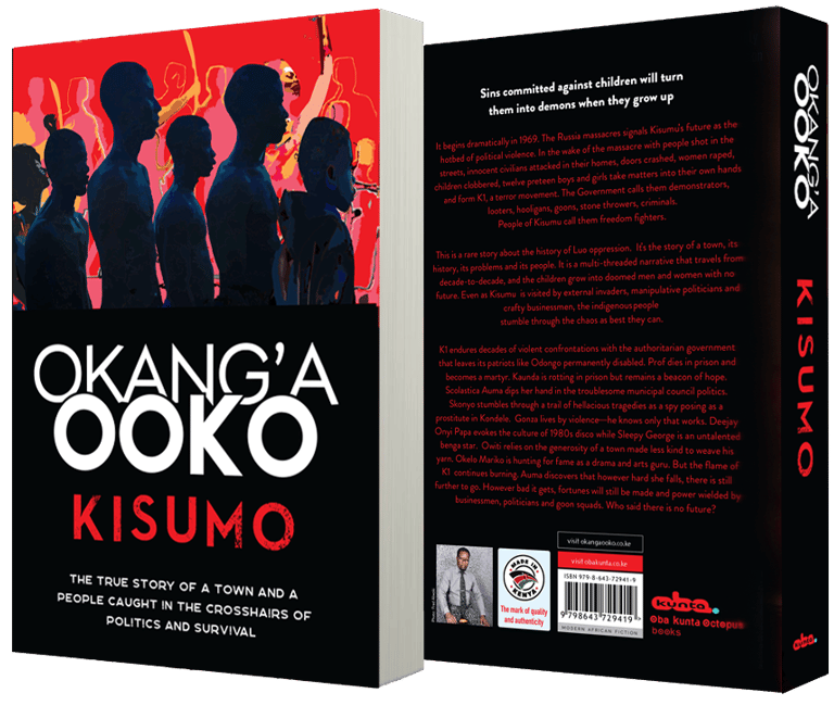
By Okang'a Ooko
Out now in paperback. The true story of a town and a people caught in the crosshairs of politics and survival.
Based in Houston, ObaBooks publishes visually compelling and culturally resonant bookstore-quality books. We design, produce, and distribute your book globally, championing bold voices and narratives that transcend borders. Our mission is to amplify a new generation of authors and document untold stories—fiction and nonfiction that reflect a contemporary Africa, the experiences of African Americans, and immigrant perspectives. We focus on culturally vibrant, politically engaged, and intergenerational storytelling from across the continent and its global diaspora, featuring literary, commercial, poetic or experimental works that break convention. We don’t just publish books—we craft new experiences for readers who crave substance, soul, and story. We build books that are ready for Barnes & Noble, Amazon, and libraries worldwide.
Coming Soon - February 2027
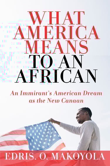

What America Means To An African


Edris Makoyola
$32
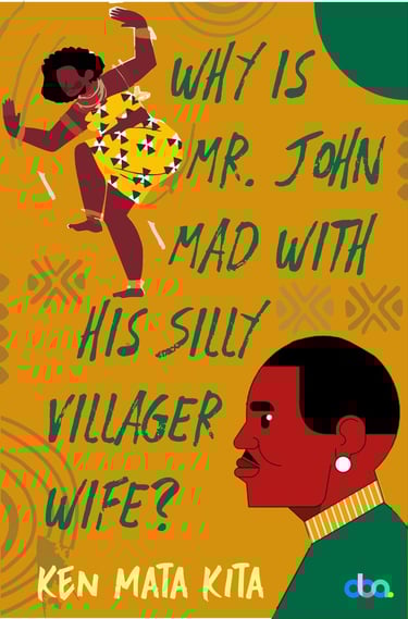
Blind Date
Why Mr. John Is Mad With His
Silly Villager Wife
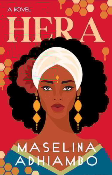
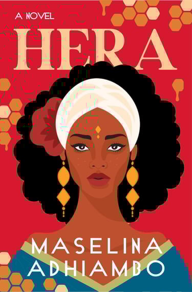
Hera
Minnie Harshey
Ken Mata Kita
Maselina Adhiambo
$25
$23
$20

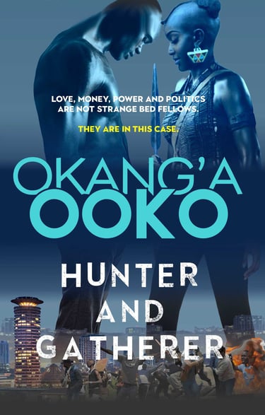


Okang'a Ooko
$22
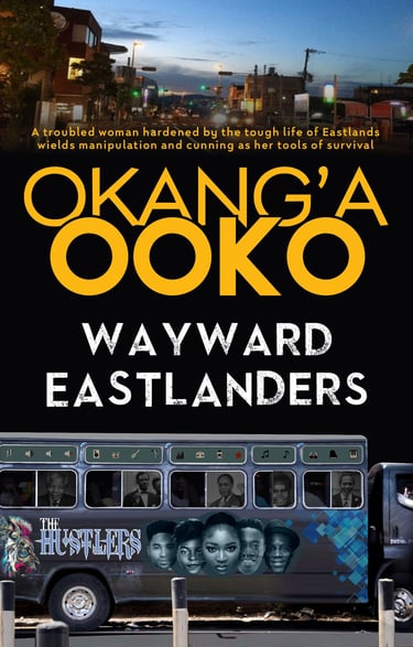
Okang'a Ooko
Okang'a Ooko
Okang'a Ooko
$21
$25
$21
Featured Author
Incredible deals on unputdownable books!
Stay connected with ObaBooks through our four short, vibrant newsletters—bringing you the latest on our books and authors, a monthly dose of poetry, gems from our rich backlist, and personal notes from the publisher.
A Division of OBA KUNTA OCTOPUS LLC
A literary, editorial, book design, and publishing studio
Arts District Houston
Sabine Street
Houston, Texas
General enquiries (please note our replies to common questions in the auto-responder):
Submission enquiries: submissions@obakunta.com
© 2026 Oba Kunta Octopus LLC
Shipping & Return I Terms & Conditions I Privacy Policy